
REFLECTIONS
I’ve always thought that image transfers were difficult because I assumed it was a long process since ordering a custom made t-shirt with your print on it takes such a long time and costs quite a lot of money. Back in Year 2 BDS module, we had to design a souvenir and I intended to do an image transfer to the packaging I made. The moment I saw a video on to use Mod Podge to transfer images and observed how much glue was placed and how messy the aftermath was, I just gave up on it. However, today’s lesson made me change my mind on image transfers. It actually turned out to be simple and fun to do. We were exposed to several methods on image transfers and all of them were simple methods which actually made me regret my decision in giving up image transfers back then.
It is best to use image transfers when you want to avoid cutting and pasting your images into a book for example. The amazing thing about image transfers is the fact that it can transfer to other materials like glass and fabric. Till today, image transfer is still used because there are still a lot of materials that can’t be printed on, and that includes large scaled materials, which makes image transfers practical. I had a lot of fun exploring the different methods of transferring onto different materials and I will definitely consider to apply these methods into my future works.
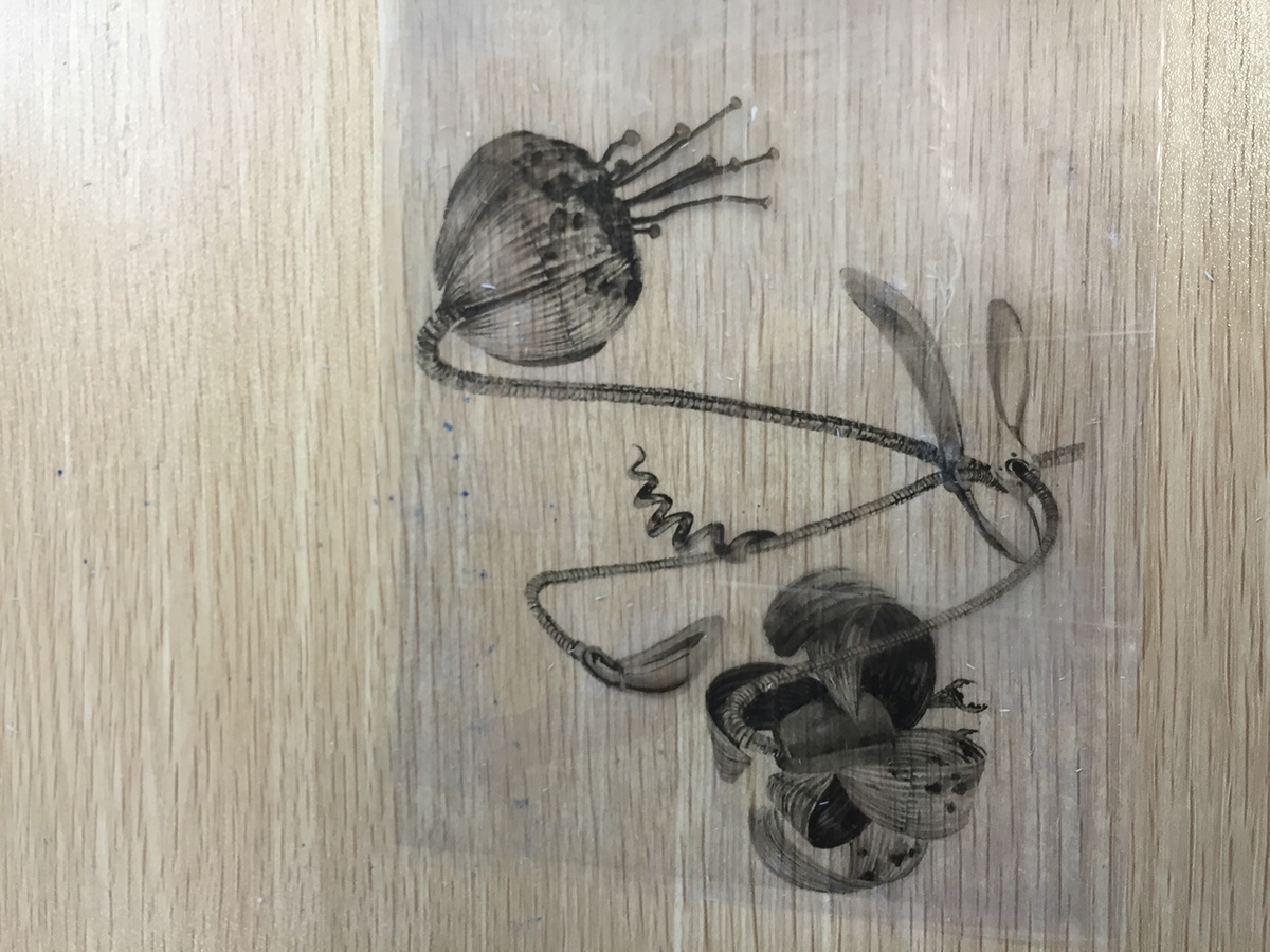
CLASS PRACTICE 1: IMAGE TRANSFER USING IRONING
This is the method that probably requires the most patience because you won't really see the results you want, unless you have the patience to wait and iron at the same time. This is actually the method that I would least recommend because it is a slow process. Nonetheless, the results you get can be truly spectacular. It's best to transfer images with darker colours to get the best results.

20 minutes and still ironing because nothing appeared even after 15 minutes of waiting.

After about 30 minutes of ironing, the iron finally manages rro transfer the darker areas of the image. Not exactly the results I expected but I guess I should pick an image with darker colours.

Second attempt! Only needed 15 minutes of ironing. Although I accidentally shifted my strip of paper, the results were still better than my first attempt so I'm pretty satisfied with with this one.

Third attempt, this time using the iron from home. Instead of wood I decided to uses fabric instead to see what results I would get.

Mysteriously, the iron only managed to get the yellow out. The more I ironed, the more yellow is transferred to the fabric. Perhaps fabric might not be the most ideal choice of material to transfer images using the iron.
CLASS PRACTICE 2: IMAGE TRANSFER USING SOLVENT
This method works pretty well in my opinion. When transferred, it appears faded but still looks aesthetically good. It kinda gives you the vintage and rustic feel since it's faded. This method is most ideal if you don't want to wait long for your image to be tranferred. It is truly a quick and easy method. But I warn you about the pungent smell. We've done image transfers before using thinner as the solvent to transfer our mythical creature design onto our lino as reference before we cut the lino design out, back in Year 1. So I am pretty familiar with this technique.

I will sacrifice my notebook for this one. No I'm just kidding. I trust that it will work which is why I decided to transfer this design onto my notebook.

I used the blending marker for this one. Really simple and convenient to use since it comes in a pen with a cap.

The results! Turned out just as how I expected it to. Having that faded effect makes it looks beautiful on my notebook.

Moving on to the spray-on thinner method. This time round I decided to find out how it would work on wood.

Almost there...

Turned out to look really faded. Well at least it gives off the old and vintage look.

Lastly, I'm trying thinner on fabric.

The thinner only managed to get some black ink onto the fabric. Not very happy with the results. Wouldn't recommend thinner to transfer images to fabric.
CLASS PRACTICE 3: IMAGE TRANSFER USING ADHESIVE MEDIUM
At last we've reached the last class exercise. Remember when I said that mod podge was the one that made me gave up on image transfers in the past? Well now it is the image transfer medium I love the most. It gives the best results as it looks as if it were printed on. Other than mod podge, there's also the packing tape method which in my opinion looks really artsy fartsy. I would definitely recommend using these methods to do image transfers. However, it does require patience, even more than the ironing technique because firstly if we're using mod podge we need to leave it to dry for a day or two. Secondly, using these techniques also require you to peel away the paper from the pasted image and that means that there will be a lot of mess. Honestly, I actually enjoy the process because I just can't wait to see what's the result is going to be like.

First attempt at mod podge method. Took me quite a while to peel off all the paper. But it was worth it because the print looks amazaing.

This was the result after drying. Apparently, I didn't peel away all the paper and left quite a bit of paper on the fabric. Even with the paper on, it still looks visually interesting.

Moving on I tried the packing tape method. As seen above, I've pasted packing tape as neatly as possible onto the image I want to use.

Pushing out all the air bubbles using a burnisher tool.

The messy part is finally here. It took a lot of patience for this since I decided to use a larger image. After a while my fingers started to feel really numb. Nonetheless, it actually looks amazig.
After peeling off most of the paper, this was the result.

Pasted it onto my notebook. Now my notebook looks so pretty. I'm super satisfied with the results.
APPLICATION BRIEF
Design a wooden signage using image transfer method. Select one of the businesses below and do a small scale mockup with wood. You can either use an existing brand name or come up with one yourself. You are free to propose any style or art direction for the design. The client is also open to an illustrative signage.
Choices:
• Florist
* Organic Food Grocer
• Café / Pub (including cat café /other novelty cafes)
• Restaurant / Eatery
Deliverable:
1.1 small scale mockup (about A4 size)
RESEARCH
I decided to the wooden signage for a Café name I came up with on my own. I decided to name my Café 'Coffeeholic' because I wanted a place where all the coffee addicts can go to. Coffeeholic a very homey, rustic and relaxing Café therefore I decided it was best to use the solvent method to create the faded, vintage effect. I also researched on retro logos to get my inspiration from.

Image source:
Pinterest, 2016. Retro Thin Line Badges and Logos. Vector Pack.. [Online] Available at: https://www.pinterest.com/pin/450852612675849952/ [Accessed: 23 May, 2016]
PROCESS

Firstly, I created the logo for my cafe on illustrator before copying it into Photoshop as a smart object.

On Photoshop I used a picture of the lalang field I took in Bintan as the backgorund because I find it really relaxing to look at thus it suits the theme of my cafe. I brought down the opacity of the image because it had a lot of blacks in it and I was afraid it might be a little too distracting. Afterall the main focus is the logo.

I then flipped it for it to be ready to be printed.

But before I send it for printing I had to be sure that the thinner at home works otherwise I'd have to go and buy a new one while I go out to print my signage design. Turns out, the thinner works well on the wood so off I go.

Photocopied a few copies at the bookstore near my house.

Mentally preparing myself first.

I wasn't very satisfied with the results especially since there's a clear line cutting through my logo as shown above. I flipped it to the back where although I've used it to test out if the thinner works on the corner, there's still enough space to do another image transfer.

Here goes nothing.

I actually turned out quite well compared to the first attempt so I decided to propose this one as my final design. On a side not, kitty came to complain about the smell.
PROPOSED DESIGN


